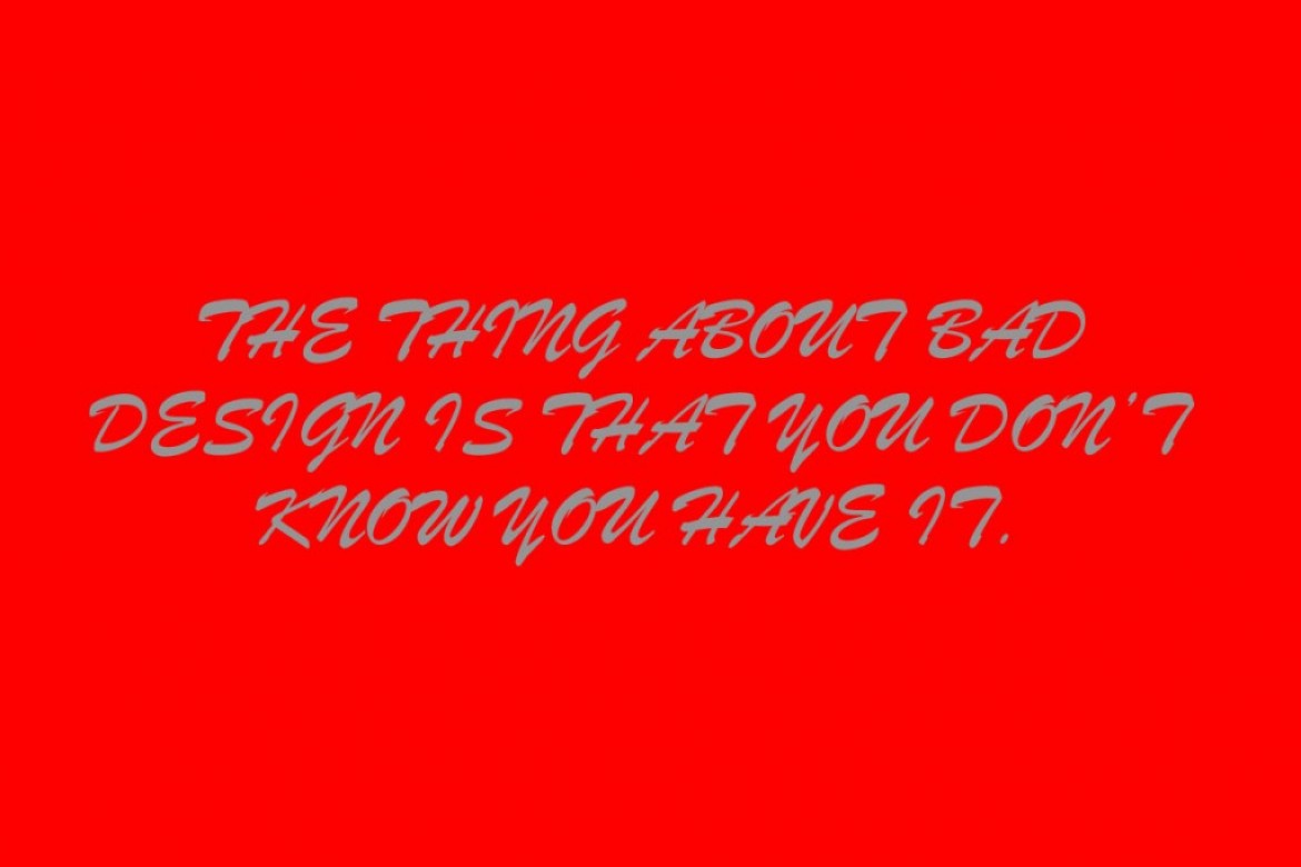
Grey On Red Is So Cool!?
Hmm, less said the better. This is what I mean when I talked about design illiteracy. When you don’t know what your doing it’s as obvious as a pimple on your nose. Most of the time it’s not what you can do with DIY design – it’s what you shouldn’t do.
I had a client query the use of white type in a red block and they asked for grey. What people don’t understand the the contrast value of colour and the right values of colour. This is something that is inherent in a designer. Something that requires an understanding of context, your customer, purpose, your target demographic and your marketplace.